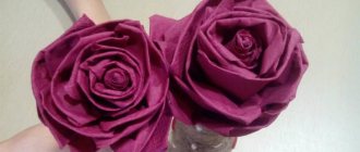
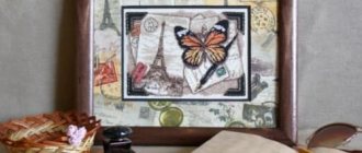
It is not always necessary to strive for detail and clarity in a drawing or painting. Due to the abundance of little things, the mood of the work and the response that it could generate in the viewer can be lost. It is worth learning to give up something in favor of the main thing. Let's try to gain this skill by painting a still life with a bouquet of flowers in gouache with careless strokes. The nature for our work looks like this:
The original photo is on the website: https://www.photosight.ru/photos/4057004/
We will need : cardboard or a sheet of A4 drawing paper, a set of gouache, a jar of water, a palette, a cloth for wiping brushes, various brushes. For this type of work, it is better to use hard brushes, such as bristles. I use flat bristles No. 10 and No. 4, as well as a couple of softer brushes for individual details, mine are synthetic flat No. 4 and round No. 3.
Since the work is “rough,” we will draw without a preliminary sketch. We start by applying the background with a large, hard brush (#10 bristles). We cover approximately 2/3 of the top part of the sheet using red (a color close to burgundy), brown and white, achieving as smooth transitions between different colors as possible.
Apply strokes horizontally, from left to right and back. The corners are darkened more, we add more brown there, there is a lit area closer to the right side of the sheet, we add more white there. The background should not be a uniform color. In the photo it seems almost black, but I don’t recommend using black too much in drawings.
It turns out something like this:
Now we apply the main color of the table with brown and white, you can mix brown with a small amount of red in some places. If you work with a semi-dry brush, then due to the hard bristles it will leave an uneven mark, imitating the surface of a table. Just apply strokes horizontally in one direction.
The main color of the fabric is close to pink. We use a mixture of white and red, and in some areas you can add a cooler pink by mixing white and kraplak.
Later we will work on the fabric in more detail, but at this stage it is good to indicate the darker and lighter areas.
Here it is better to apply strokes in the direction of the main folds of the fabric and use a semi-dry brush with a large amount of paint, adding just a little water.
Now we can arrange the main objects of our still life in the drawing. Using whitewash and a thin soft brush we outline the outlines of the decanter and tray with a glass and quince. If it’s really difficult, you can first draw the outlines of objects with a simple pencil.
Leaves and flower stems are visible inside a glass carafe filled with water. Let's designate them with large strokes, using green, ocher and violet paint.
Now you can start working on the flowers. Using short and wide strokes in different directions, using a No. 4 bristle brush, paint yellow flowers.
We put more paint on the brush, almost like a spatula, so that the strokes are raised. We paint lilac flowers with thin and long strokes, using purple paint mixed with white.
Let's not forget to add greenery between the flower buds; you can lighten the green paint a little by adding yellow to it.
We specify the shape and size of the tray, glass and fruit and apply their primary colors. I enlarged them a little. There is no need to worry if you made a mistake somewhere, gouache is a paint that easily covers previous layers, so you can always correct something if you don’t like it.
For the metal tray we use gray (white + black) with a small amount of blue. We designate areas of light and shadow by diluting the paint with the required amount of white. For quince we use yellow, diluted with white in light areas, and add a little green to the paint in dark areas.
Again, we do everything with large strokes, using a lot of paint and a hard, medium-sized brush.
The main objects and colors of our still life are applied. Now we will go through all the work again in a circle, clarifying and detailing. Always try to work on the drawing as a whole, gradually bringing it to the desired accuracy.
So, we begin to refine the folds of the fabric. To do this, we look for areas of shadows (you can look at the nature a little squinting) and work them with purple paint, varying the shades by adding white and speckled paint.
Watch the direction of the strokes, try to apply them in the direction of the folds.
And we refine the light areas of the fabric with pink and white, with a dry brush. You can go over the dark areas a little with a dry brush with almost no paint, so that only barely noticeable traces remain.
Let's move on to the decanter. Here I use a softer brush (synthetic flat no. 4). We indicate the water level in the carafe with a white line, somewhere thicker, somewhere thinner.
Please note that the line is not straight, it bends in an ellipse, repeating the shape and volume of the decanter. The water in the decanter is a little cloudy, so let's put a little white in it.
In this case, the brush should be almost dry and there should be little paint on it, so that the color of the background and leaves can be seen through the strokes. Let's add highlights to the decanter and its handle using white.
Let's specify the flowers. For yellow ones, use ocher and white with yellow paint. Mix paints in different proportions to create different shades. For lilac flowers we use white, purple and maybe also kraplak. Let's add more yellow centers where they are visible. We refine the greens by adding darker and lighter shades.
Now we do the same with the glass, tray and quince. We refine the colors, add shades and highlights to the glass. We paint the water in the glass with white and a small amount of blue. We add ocher and green to the quince colors, make the highlights brighter with white, paint the “butts” with green and brown. On the tray we indicate brighter shadows.
The finishing touches remain. Using a thin soft brush, paint the shadow of the tray on the table with a mixture of black and brown paint. Make the area behind the decanter darker. On the tray you can paint small reflections from the quince in yellow. We clarify the angles on the folds of the fabric. This is what my finished drawing looks like.
- What about yours?
Source: https://izotika.ru/naturmort-s-cvetami/
Making a basic palette for a beginning manicurist
For masters who have been working in the nail industry for a long time, who have tried a lot of different materials, studied customer requests and learned to track recurring trends, it is not difficult to create an optimal palette of gel polishes. But what should beginners do? What to rely on when selecting basic materials? Let's look into the issue and create a basic palette using TM UNO as an example.
Base coat
When choosing a base coat, you should pay attention to two of its characteristics: consistency and properties.
Consistency is important primarily for the master. Bases can be liquid, medium-thick or thick. It is easier for beginning craftsmen to work with medium-thick ones, since they are better distributed over the plate than thick ones, but at the same time they do not require the same speed of work as liquid ones.
As for the properties, here we are talking about the hardness/softness/elasticity of the base. Solid bases hardly bend after polymerization and are suitable for strong or brittle natural nails. Elastic bases, as the name suggests, remain flexible after polymerization and are suitable for soft, weak nails. As a rule, hard bases are more liquid, and elastic bases are slightly thicker.
Based on the fact that clients with very different nail conditions will come to the master, it is better to be prepared and have bases with different properties on hand. Our choice:
Top coating
The main requirement for a good finish is resistance to damage and color retention. And, of course, ease of use. Just like bases, topcoats have different consistencies - from liquid to thick - and just like with bases, it is better for beginners to start with medium-thick topcoats.
Another important point is the presence of a sticky layer. Tops with a dispersion layer are more suitable for soft and flexible nails, as they are more elastic. However, they take more time, since after polymerization the sticky layer must be removed. Tops without a sticky layer wear well on strong and hard nails and are suitable for fixing various types of designs.
Effective tops do not have to be included in the main palette, but in general they significantly expand the toolkit. Matte, “velvet”, with shimmer - even the most ordinary monochromatic manicure can sparkle with new colors.
Our choice for beginners:
Colored gel polishes
The basic palette does not have to be very large. Even experienced craftsmen should remember that too much choice can rather prevent clients from making a decision. It’s better to limit yourself to a set of a couple of colors and gradually add trendy shades or colors frequently requested by clients.
Basics:
Black, white and gray colors are the foundation of any nail palette. They are used both independently and for drawings, jackets, etc. UNO thick gel polishes require 2 thin layers for flawless coverage.
Nude shades:
Natural shades reliably hold the leading position in popularity, as they always suit everyone. In addition, they are an excellent basis for various patterns and designs.
Red palette:
There are colors that stay in trend for a couple of seasons, and there are unshakable classics. The latter, without a doubt, includes shades of red and pink. It’s good to have both cold and warm versions of them in the basic palette.
Rainbow shades:
It’s good if the basic palette contains shades of primary colors: blue, green, yellow, purple, brown. Choose them based on the trends of the latest seasons or according to your taste!
Source
How to make a palette for acrylic paints
I would like to share with you my experience in simplifying the work with acrylic paints.
I often have to use these paints when completing various orders - from toys to furniture painting. I really like Acrylic for its qualities, but, in my opinion, it has one drawback - it dries quickly on the palette. Then it’s inconvenient to work and the paint consumption is high. And given that paints are quite expensive now (I use Polycolor acrylic. maimeri), it’s a shame to waste money.
So, I suffered for a long time, and then I decided to look on the Internet how people cope with similar problems. Oddly enough, I didn’t immediately find information about the “drying retardant”, but I did find information about the palette for acrylic. It was proposed to make the palette in a large “Fereiro” candy box - a plastic box, unbreakable, with a lid. The option is very good, but! Spend about 1 thousand rubles on the palette. I didn’t want something , even taking into account the delicious candy bonus. So I decided to try to build something from scrap materials.
It turned out not bad at all, in my opinion, and much cheaper
I needed a plastic tray - if you don’t have a suitable one at home, you can easily buy one for your household. stores The tray should be large enough, with low sides. My tray measures approximately 32 x 22 cm on the bottom.
You also need paper - tracing paper for baking. This is also found in almost every home (I must say that I tried everything that was in the house - tracing paper in rolls, which I use to create patterns for clothes, tracing paper for drawing - expensive high-quality tracing paper, and some other tracing paper that turned out to be in stocks).
Baking paper is good because it is quite thick and, as it were, oiled. “Oilyness” does not affect the paints, but it does not allow the paper to “go limp” and tear when you smooth out the palette and subsequently mix the paints.
We also need a rag. These can be ordinary kitchen napkins, non-woven ones. I buy them for the kitchen, for wiping tables. They are cheap and sold in all supermarkets and hardware departments.
We will also need a small spray bottle. Usually they are available on the farm. I have it set up for spraying flowers.
And to save our palette we need some kind of flat thing. I used a piece of pressed cardboard. But I also happened to have a glass cutting board - it also turned out to be a good lid. Usually I put cardboard on the tray, and this glass board on top - to make it heavier and make the lid fit more tightly to the palette.
Making such a palette takes approximately 15 minutes. Of course, after running around the house and looking for trays, rags, sprinklers
Now I’ll show you step by step in photographs how everything is done:
1. What we need for the palette: tray, tracing paper, spray bottle, cloth.
2. Take a cloth, previously cut to the shape of the bottom of the tray with a slight overlap on the sides, and put it in the tray. We go to the water and pour water into the tray so that the cloth is completely and very well wet. She even floats a little in the tray
3. Then drain the water so that the cloth does not “swim”, but lies firmly at the bottom.
4. Take a roll of tracing paper and cut it approximately to the size of the tray. Place it on a cloth and sprinkle water on top.
5. Having slightly straightened the paper at the bottom, let it get wet and carefully straighten it with your hands to distribute it evenly, expelling air bubbles and not tearing it in the corners. After this, we cut the tracing paper closer to the size of the tray.
6. Trimmed and straightened again around the perimeter. We need as tight a fit as possible to the sides so that there are no large voids of waterproof paper left in the corners. If the paper is not wet enough, spray it with more water. But without fanaticism!
7. After all the previous manipulations, we need to wrap the edges of the tracing paper under the cloth.
This is necessary so that the tracing paper dries out less and does not “curl” and so that the edge of the paper does not get in the way when working.
We take the paper together with a rag, bend the tracing paper and apply it all to the side (overlapping). I usually do this along the long sides of the tray. And for short ones I simply leave the paper uncovered. It looks like a container made of tracing paper.
8. This is how the result should turn out. Don't forget to keep the tray wet! And the cloth keeps the palette moist all the time. But there is no water outside!
Then you lay out the paints you need for the job. The palette is large - there is enough space for everything and there is room to mix paints.
9. From time to time I spray the palette with water. This should be done not directly, but from afar , so that the water does not flood the paint, but only slightly moistens the palette.
10. After you have finished working, you need to moisten the palette again and close the tray with a lid. It is desirable that there are no cracks. I press something else on top for density.
The bottom photo shows another version of the palette. Everything is the same, but in smaller sizes and without a tray. Sometimes you don’t need a large amount of paints and the work won’t take long. That's why I make the palette on a dessert plate - it's flatter than a saucer.
We also take a cloth, wet it generously and wrap it in tracing paper. Then we put it on a plate and lay out the paints for work.
And below is an option with a box of chocolates. They gave me chocolates in the right box, but a small one
I haven't tried to work in it yet. But the size of the box and the height of the sides are already a little confusing - will it be convenient to mix paints on such a palette? And it looks like it will be very convenient to store the palette.
I'm showing you this option as an example. Suddenly you have a big box of delicious chocolates!
In conclusion, I want to say that working with acrylic on the palette that I presented to you is very convenient.
The duration of work on it was a maximum of two weeks, 5-8 hours a day with breaks. If the break is for 1-2 days, in this case I just periodically came up and sprayed the palette.
The palette does not go out, to my surprise
If you didn’t tear the paper while working, then you can change it quite rarely. Sometimes I just add water to the tray directly from the tap - I bend the edge of the rag and put it under the water. If there is any excess, I drain it.
Or once a week or 10 days you can change the tracing paper, if it is very dirty with paint and there is no living space on it. You need to throw away the tracing paper with the old and sometimes dried paint, rinse the cloth. Then do all the operations to recreate the palette
I found it pleasant and convenient to work with acrylic
I hope you find this information useful too.
Good luck to you and all the best!
How to apply gel polish to a palette correctly
A practicing manicurist, a beauty salon store, a training center - everyone needs samples of materials. There are special palettes of different types onto which varnishes are applied. Sometimes well-known brands sell such palettes with the numbers of varnishes, gels and other coatings already applied.
But over time, some bottles run out, and a new palette has to be prepared. How to apply gel polish to a sample? Do I need to treat the surface with a buff? Should I apply a base? But what about neon coatings, since they are almost transparent?
Factory of artistic paints "Nevskaya Palitra"
"Master Class" - time-tested professional art paints. Recommended for professional artists seeking authenticity and durability of their works.
The Master Class series is aimed at the most demanding customers - professional artists.
Professional products made on the basis of high-quality expensive pigments (including pigments of our own production: coloring earths, cadmium and cobalt pigments) and carefully selected binders ensure the greatest authenticity and durability of the finished artwork.
The Master Class series includes sets of oil, tempera and gouache paints, as well as a large palette of individual tubes and cans of various packaging.
Competitive advantages of the Master Class series:
- High-quality pigments of our own production, including coloring earths; cadmium and cobalt pigments
- Fine paints with high pigment concentration
- The main part of the palette is mono-pigment and light-fast paints
- Purity and depth of colors
- Uniqueness and originality of shades
Oil paints "Master Class"
Master Class oil paints contain high-quality pigments (including pigments of our own production: cadmium and cobalt pigments, coloring earths) and a binder. Paints that are prone to color changes are made from a special non-yellowing oil. The rest of the colors are based on specially processed linseed oil. Highly artistic oil paints “Master Class” are products for the most demanding artists.
- Oil paints are available in 46 ml tubes (99 colors), as well as in sets of 6 colors in 46 ml tubes, 8 and 12 colors in 18 ml tubes.
- Artistic oil paints "Master Class"
Extra-fine artists' oil color “Master-Class”
- 101
- 100
- Neapolitan yellow-fawn 223
- 222
- 209 PY37, PY42, PO20, PW4
- 207
- 203
- 200
- 201
- 202
- 228
- 304
- 333
- 353
- 354
- 312
- 302
- 303
- Madder lake red permanent 339
- Madder lake rose permanent 338
- 617
- Kraplak purple durable Madder lake purple permanent 340
- Manganese purple light 614
- Cobalt violet light 602
- Cobalt violet dark 603
- 341
- 613
- 528
- 527 PG7, PB15, PW6, PW4
- 512
- 503
- 505
- Cobalt blue spectral 502
- 501
- 521
- 500
- 518
- 516
- Chromium Cobalt greenish blue 709
- Chromium Cobalt bluish green 708
- 507
- 733
- 732 PG7, PY83, PW6, PW4
- 703
- 720 PG7, PB15, PG17, PG8, PY1
- English green light 737
- English green dark 738
- 704
- 706
- 705
- 716
- 727
- 701
- 736
- 702
- 739
- 700
- 715
- 740
- 206
- 218
- 242
- 205
- 241
- 247
- 245
- 246
- 248
- 309
- 311
- 358
- 359
- 360
- 619
- 356
- 300
- 301
- 601
- 427
- 816
- Purple-brown Sevan 428
- 405
- 406
- 414
- 204
- Mars orange transparent 308
- 402
- 403
- Mars brown dark transparent Transparent Mars brown deep 404
- 401
- Natural umber Leningradskaya 407
- 408
- 808
- 812
- 817
- 800
- 813
- 811
- 801
How to choose a good palette
There are different plastic molds for applying varnish samples. Some have a completely transparent structure, others are milky, and others are white.
To apply the sample, it is better to use milk palettes. Or natural, slightly yellowish in color. The applied sample on them will be closest in color to the painted nail.
Some palettes cannot withstand the action of solvents - acetone or alcohol. These are not worth purchasing. Good professional palettes are made from durable plastic and are easy to work with.
Why does an artist need a palette?
First of all, our heroine serves as an indispensable assistant in choosing the right color. Very rarely does an artist manage to achieve the desired range of colors on a canvas with one stroke. In most cases, this is preceded by a long and painful search. Here the palette is simply irreplaceable. It saves the author from constant corrections in the picture itself.
Secondly, not all paints, like watercolors and gouache, are packaged in convenient trays and jars. Oil and tempera, for example, are most often sold in tubes. Keeping them open costs you more.
They can dry out and deteriorate. Again, you can’t do without a good palette here. I squeezed the desired colors onto it and write with pleasure, and the tubes can be securely screwed on and hidden in a box.
Thirdly, having a professional palette is a rule of good form for any painter. Imagine a symphony orchestra conductor in shorts and a T-shirt with a ladle in his hands instead of a baton. Funny. The painter without a palette is very similar to him.
However, there are exceptions everywhere. And good form is becoming more and more vague and controversial. However, we are not having a philosophy lesson. We're talking about an important tool in a painter's kit. That this is so is unlikely to be denied by anyone, so let’s talk about how to acquire a reliable weapon.
How to choose a palette for drawing
The simplest palette is a regular piece of paper that you use for drawing. Don't rush to throw away unsuccessful work. The reverse side of such a sheet can be a wonderful place for mixing watercolor or gouache paints. Many people are so used to this palette that they don’t want to change anything in their habits. And it should be!
Special devices for paint batches are much more convenient and economical. The paper absorbs some of the paint and dries quickly. This is why plastic and metal counterparts are much more effective in this regard. Some people love ceramic and glass palettes. But these assistants are only for very neat artists, which is very rare among creative people.
We went through almost all known materials, but did not touch upon the oldest and most popular to this day. Of course you guessed that this is a tree. Wooden palettes still serve reliably for most painters. Let's look at the main qualities of such tools that you should pay attention to when choosing them:
- Breed. This refers to the type of wood from which the palette is made. Usually light but durable types of wood are taken: apple, pear, beech, birch.
- Form. Usually it is a rectangle or oval. For convenience, a hole is made in one of the corners for a finger to make it comfortable to hold.
- Surface. Must be well polished, without defects and corrosion.
- Primer. A wooden palette can be soaked in vegetable oil or treated with an adhesive solution. After this, it is dried well. To prevent warping, place it under a press while drying.
So, you’ve got a great friend with whom you’re ready to go through thick and thin, but you don’t yet know how to use her. There are no exact rules here. Over time, everyone develops their own style of using the palette. However, the majority of recognized masters noticed that generally accepted principles have never harmed anyone. Let's repeat them too:
- Don't use too many colors. Typically, 6-8 primary colors are enough to create a rich piece.
- It is best to place them on the surface in a spectral sequence at a distance from each other in order to mix with other colors in between.
- Be sure to wash the palette well after use. You can, of course, scrape off the dried paint residue after a week, but it’s better to wash it off while it’s still fresh. Having accustomed yourself to this, you will not have to often change the much-needed tool.
- Store the palette in a dry, dark place, away from heating devices.
Well, that’s all that aspiring painters need to know about our heroine. Feel free to mix colors on it, remember our advice and resolutely go towards your intended goal.
Source: https://izokurs.ru/blog/hudozhestvennaya-palitra/
Applying gel polish to the substrate
To properly apply gel polish to the palette, you should determine the degree of its transparency. Opaque coatings are applied in two layers, translucent ones in three. Cover the top with top. If the gel polish is translucent - a haze for a jacket or berry, then make a base: the first layer is painted with a dense nude shade, similar to the color of a natural nail.
You can make several options for this coating for beige, peach, and pink substrates. Each color can be warm or cool, which increases the number of options. With such a palette it will be easy to determine the natural color of the client’s nails and show her how gel polishes will look on her hands.
If the gel polish is neon, a white base is made for it - the same as for nails. Then it will be bright. For gel polishes of the “cat’s eye” series and for mirror rubbing, a black base is made.
Palette - what is it? Dimensions and shapes of an artistic palette for paints:
Artistic palette - what is it? In the original sense of the word, it is a hard, flat surface on which paints are applied and mixed.
What you need to know about the palette?
What is a palette? This essential artist's tool is typically made of wood, plastic, ceramic, or other hard, non-porous material.
Palette sizes and shapes can also vary greatly. The most popular is the oval version, made of wood and designed to be held in the artist’s hand.
Watercolor palettes are most often made of plastic or porcelain.
What do you need to know about this essential oil painting tool for an artist? The paint palette is probably one of the most iconic symbols. It is often taken for granted, but it is one of the most important tools for painting.
Palette - what is it?
This word actually has more than one meaning. Several definitions can be given:
- This is a thin board or slab (traditionally made of wood) onto which the artist lays out colors and mixes them.
- This is the range of colors used by an artist for a particular image.
- In a figurative sense, this is a set of expressive means of the artist (writer).
Nowadays there are many types of palettes available in the market for oil painting. They are made from a variety of materials, from wood to plastic. As for shapes and sizes, this is just a matter of personal preference, since there are many options in this area as well. Both before and today, the oval wooden palette is considered the most traditional.
An indispensable attribute of a true artist
A paint palette with a hard, even surface is used by the artist to organize and mix colors. In addition to the oval shape, a rectangular or classically curved shape is widely used, which is specifically designed to be held in the hand and rests on the space between the elbow and thumb.
What are palettes made of?
The material from which an artist's palette is made can be very different. Traditionally it is a tree. Plastic is another popular material. These trays are strong enough to withstand solvents and work well with oil-based paint.
They are usually made in white. Another material suitable for making a palette is multi-layer wax paper. The top sheet is torn off and used for mixing and applying paints. When the session is completed, the sheet is quickly and easily disposed of.
Less common are porcelain and ceramic due to their breakable properties. Glass can also be used as a palette, it is nice and smooth and the paint washes off easily. However, this is the most dangerous option; if you accidentally drop it, it can break into small pieces and cause a lot of trouble.
Shape and size
An artist's palette is often found in a rectangular or classic kidney shape. The latter has a thumb hole at one end. The shades are located along the edge of the palette shape and are easily accessible, which is also important. On the other hand, the advantage of rectangular planes is that the paints can be arranged in even rows.
When it comes to size, some palettes are large and others are smaller. Many of the Old Masters prefer to use a small palette. This is convenient when working on a painting in several stages, therefore, fewer colors are used for each session.
Some of the large palettes used by artists today are designed to be able to produce any color and many variations when mixed on one surface, so there must be enough space.
Colors and tones
The most important thing in the palette is its color. It is much easier to get the desired shade if you mix them on a surface of the same color as the canvas.
If you mix paint on a brown wooden palette and then apply the same paint on a white sheet, the color will differ, albeit slightly, from what was mixed on the palette. For example, pink on white will look darker, but on brown, on the contrary, it will look lighter.
Correct position
What is a palette and how to hold it correctly? There are two main positions - on the table or in your hands. Some artists prefer to hold it directly while drawing. This makes it possible to work from different points of view.
Others prefer to place it on a table and mix paints there. Staff palettes tend to be larger, which allows for more color mixing options. Whatever position you choose is just a matter of convenience and personal preference.
Everything is in its place
Organizing and systematizing shades on an artist's palette is a very useful skill. It may seem like a small thing, but a well-organized surface will make the entire process easier and more enjoyable. How you organize the colors on your palette is entirely up to you.
There is no right or wrong way. Some prefer to organize colors from light to dark, while others arrange their colors from cool to warm. Many artists lay out their paints according to their own compatibility systems.
A paint palette is something that everyone is familiar with, not just artists. Everyone probably had their own (and more than one) plastic watercolor palette in childhood. They come in a wide variety: this applies to sizes, shapes, and materials. The most popular is a small wooden palette.
Source: https://www.syl.ru/article/322120/palitra—chto-takoe-razmeryi-i-formyi-hudojestvennoy-palitryi-dlya-krasok
How to apply gel polish to a palette: technology
In order for the coating to adhere well to the surface, there must be adhesion - adhesion to the material. For this purpose, natural nails are specially prepared, sterilized and buffed. If the palette is new, you don’t need to wipe it with alcohol - it’s clean. You just need to avoid leaving greasy fingerprints on it.
Glossy surfaces that shine are treated with a 400 or 240 grit buff. After this, colored gel polish can be applied. It doesn't need a base, it will hold up well anyway. Apply two layers, with polymerization in a lamp. After this, the sample is coated with a glossy topcoat, polymerized and the sticky layer is removed.
Gouache paints “Master Class” NEVSKY PALETTE, set of 12 colors, 40 ml each
Gouache paints “Master Class” NEVSKY PALETTE, set of 12 colors, 40 ml each
Artistic gouache “Master Class” NEVSKY PALETTE for painting, graphics and decorative works has high hiding power, mixes and spreads well. Paints applied to the surface are easily washed out, after drying they become dense, matte, velvety, the lower layers are not visible through the upper ones. Any materials with a smooth, slightly rough surface are suitable for gouache painting, especially paper, cardboard, and canvas. – The Nevskaya Palitra Artistic Paints Factory has been producing the highest quality products for over 80 years: watercolors, oils, tempera, acrylic, gouache, materials for decorative and applied arts, intended for professional artists and creative enthusiasts. Art materials from Nevskaya Palitra are successfully used for restoration work carried out in the most famous architectural monuments, such as the Hermitage, Tretyakov Gallery, State Russian Museum, St. Basil's Cathedral and many others.
Application area
For drawing, painting, graphics, decorative works.
Product characteristics
— a set of gouache paints in 12 plastic jars of 40 ml, packaging: cardboard box — the paint set contains 12 colors: titanium or zinc white, light yellow, light or golden ocher, red kraplak or red ocher or English red, red, turquoise or azure iron, ultramarine, light or dark violet, bright green or emerald light, dark green, burnt umber, gas soot - a water-based composition of finely ground pigments with the addition of gum arabic - a binding adhesive component of plant origin - manufacturer: Nevskaya Palitra, Russia
Instructions for use and nuances
Bristle brushes are suitable for painting with undiluted gouache paints; if you want to thin the paint with water or apply a thinner layer, use soft kolinsky or synthetic brushes. For gouache painting, choose high-density paper with a rough surface, such as watercolor or cardboard.
Source: https://samokraska.ru/artpaints/guash/gouache-masterclass-2
Polymerization in a lamp
Before applying gel polish to the palette, you should take care of its placement in the lamp. A drop of gel polish may end up on the base of the manicure lamp and stick to it. To avoid this, you can use a small plastic cutting board for your palette.
If during the polymerization process a drop from the palette sticks to it, at least you won’t have to remove and clean the tray. The stuck drop can be cut off from the plastic with a scraper, and then the end can be cleaned with an old file.
What do you need for oil painting?
Oil can confidently be called the main material in the history of painting. No watercolor, tempera, pastel, and especially acrylic can compare with him in terms of the number of masterpieces he painted. Therefore, it is not surprising that you decided to master this interesting, but difficult technique!
But keep in mind: a full set of materials is expensive; before purchasing, decide whether you really need it. Everything you need can be purchased at a specialized art store or at ozon.ru with delivery throughout Russia (links to products in the article). So, what will you need at the start:
Paints
To start, take no more than ten to twelve tubes. Over time, you will understand which colors you use more often, which shades are more necessary, and which you can discard, and complement your set. It is better to take tubes no larger than 50 ml so that the paints do not have time to thicken and their packaging does not have holes.
Take one tube of the following colors: zinc or titanium white, red, ultramarine, green, blue (for example, FC), yellow, ocher, umber (dark brown) and a couple of shades that you like. It is better to take whitewash in duplicate; its consumption is much greater than other paints.
I still have the black tube almost untouched, since I adhere to the impressionist dogma: it does not exist in nature, which means why use it in painting? A natural shade close to black can be mixed on the palette yourself using green, umber and blue.
If you plan to start with drawing a person (which I strongly advise against doing at first), then it will be difficult to do without nude and Neapolitan pink. Those unsure of their abilities can start with an inexpensive set of eight or twelve tiny mini-tubes from Sonet.
In general, I highly recommend St. Petersburg companies: Sonet, Ladoga, Master Class. Italian and French materials are quite expensive. An artist friend of mine swears by Gamma paints, but I haven’t tried them myself.
Canvases
Choose a completely finished and primed canvas, because independent preparatory work is a whole epic. For the first paintings, which you are unlikely to want to hang on the wall, canvases on cardboard are suitable - to save money. Then I recommend switching to more “serious” and “solid” canvases on a stretcher.
Canvases on cardboard are cheaper, but always require a baguette and do not come in large sizes. A little life hack: you can save money on the frame if you take canvas sizes ending in zero (40x50, 30x50, etc.). Because for such a painting you can easily select a ready-made frame, and this is a more budget-friendly option than making it to order.
To frame a canvas on a stretcher, in any case, you will have to go to a framing workshop; there are no suitable ready-made frames. But the trick is that a frame for such a painting is generally optional, especially if the work is painted in a free, impasto manner. As for the size of the canvas, it depends on taste and color.
At the beginning, it is better to avoid very small miniature formats (too elaborate work) and, conversely, huge canvases (there may not be enough gunpowder to complete). Sizes from 20x30 to 50x60 seem quite suitable for a noobist. In addition, canvases differ in composition (linen, cotton), grain size and density.
Over time, you will find out through experience what is right for you. Personally, I write on everything indiscriminately.
Brushes
Soft watercolors are absolutely not suitable. Choose synthetic or natural bristles. I prefer the first option, but this is a matter of taste and habit.
Beveled, rounded, square and unusual exotic shapes are good for various artistic purposes; over time it will be great to have them all in your arsenal.
And first you can stop at a ready-made set (for example, Pinax or Malevich), and then replenish it to your liking. When choosing live, make sure that the pile is not too soft and pliable, it should be springy.
This is especially true for very large brushes, which are close in size to paint brushes. Immediately after use, dry your brushes with a cloth and wash them thoroughly with soap until the soapy water runs clear. This is long and hemorrhoidal, but it will significantly extend their lifespan!
Diluent
Tee (a mixture of dammar, linseed oil and turpentine). When using, you can simply pour it into a jar lid, as I do. Or in a special oil can, which is conveniently attached to the palette.
A tee is needed to make paints more liquid: you simply dip a brush into it and add the liquid to a drop of paint on the palette.
For painting, I almost never use thinner, but if the oil sausages on the palette have thickened in a day or two or even more (up to a week), this is the right thing – it will bring them back to life.
Palette
Any wooden one. Even a cutting board will do (if you don’t mind the lack of a special “eye” for your finger). After each use, you need to clean it with a palette knife and then with a rag.
I frankly admit that I am too lazy for this task, so once every couple of months I pick off a layer of dried paint with a special scraper or simply buy a new palette (don’t repeat after me, it’s a pity for trees and money!).
Easel
If you wish, you can do without it at the first stage; after all, the purchase is not cheap. If you don’t have a spacious workshop at your disposal, then give preference to a compact tabletop easel for small paintings or a more versatile wooden tripod.
For myself, I spent a long time choosing between the budget Malevich and Pinax, and in the end I irrationally settled on the first. Both are actually good! A sketchbook with a box for paints will kill two birds with one stone: it can be used both for plein air and for a home workshop. The downside is that it is bulky and expensive (and mine turned out to be fragile).
Source: https://zen.yandex.ru/media/id/5a928a644826776268e5af72/5b7c10ead709e900a992d105
How to quickly fill a chamomile palette
The most common shape for nail polish samples is chamomile. Beginners sometimes have difficulty applying gel to it. But there is an easy way to apply gel polish to a chamomile palette.
Due to the fact that this palette is round, you will have to apply the gel polish in parts. You can paint one “petal” at a time, then it will turn out neat, but it will take a long time. Therefore, we apply gel polish to four petals and send them to the lamp. If you paint more, the gel will flow down, and the coating will become transparent in the center and with streaks on the sides of the petals.
So, four petals each, paint the entire circle in one layer. Then the second layer is repeated, after which it is covered with top. Here's how to properly apply gel polish to your palette.
LiveInternetLiveInternet
Quote from Nadezhda-Esperanza's message
Read in full In your quotation book or community!
How to make a palette for acrylic paints, Tips from Walter O'Neill Tip taken here... I'll explain how I make my palette for painting with acrylics. By following these steps, you can create your own palette to store your acrylic paints for months instead of minutes. What kind of magic is this? Maybe witchcraft, you say? Hah, this is just one of the many useful things I learned in art school, and I thought I'd save some useful tips for you and just write a post like this. Step 1. Stop! Time to make a palette! Get yourself a cute 11" x 15" ceramic palette like this one. These things are made of metal and have a good ceramic coating. (that is, enamel...) I've dropped it an unknown number of times and it's still usable. Do you really need one exactly like this for this tutorial? The hell with it. Just take your rectangular container, with sides about an inch wide. A container for food, a baking dish, heck, even a lasagne dish will work well for this.
Step 2: Build the foundation. Line the bottom of the palette with a paper towel. I usually use 6 or so layers of paper and it works fine. Try to keep the surface completely flat, if you have a thickening of paper in the middle of the form, add a little paper around the edges so that the surface is even.
Step 3: Get it wet! Fill the palette with water until the paper is completely wet. Hold the paper and drain the excess water, we want the paper to be wet and not turn into a cup of soup. If the palette is too wet, it will be reflected later when your paints become limp, dissolving in excess water. Read on, it will only take a minute.
Step 4. All air bubbles must die! Place your hands in the center of the palette and, moving towards the edges, smooth the paper, trying to force out any air bubbles that may remain between the layers of paper. It may take a few strokes like this, but in the end you should be left with a nice base for your wet paper palette.
Step 5: My paper or yours? Try to buy a good tracing paper that fits the size of the palette you created. Unless you work primarily digitally (in which case you may not be reading this tutorial), you simply must have a good tracing paper in your arsenal at all times. It has many (yes, yes, I said many) uses. For my palette I use Clearprint Vellum. It's not cheap, but it's tight and reliable and worth the money.
Step 6. Tracing paper is not just for copying. Take a sheet of tracing paper and place it on top of the toilet paper blank. The tracing paper layer will be the surface of our palette. Please note that the tracing paper begins to become moist because... there is wet paper underneath. This is fine. Same as in step 4, smooth out the paper and remove any air bubbles underneath.
Step 7. Do you like it? This is our ready-made palette for acrylic paints. A backing of wet toilet paper will moisturize paints that are losing moisture since there is no air underneath. Really cool science? After a few days or so, you can add a little water to the toilet paper to keep the palette moist. Simply fold back the corner of the tracing paper and add the required amount of water.
Step 8. Now go ahead and draw some crazy stuff! I became obsessed with this palette when I realized that my colors were mixing before I started painting. Here is an example of a simple grayscale I made while painting a black and white painting from my gallery. I started with gray and started mixing in white (top), and black (bottom).
END!!! When I don't need paints, I simply cover the palette with a plastic lid and put it in the refrigerator. Since paints can stay fresh for months, there is no need for garlands of wet paper hanging all over the room and becoming mildewed. I hope the lesson was useful! Author of the lesson and original text of the lesson: Walter O'Neal Translation from English: Iced Wings Translation note: thank you very much Galka Zastava for the correction in the translation Addition from Galka Zastava - Try to find baking paper. It has two sides - smooth and rough. If you put it with the smooth side up, it works great. And I recently read some advice on WetCanvas. Place a copper coin in this palette. They say it prevents I-know-what from multiplying. Something like mold. It's basically invisible, but it smells very nasty. I was dealing with the smell. If you work on something for a very long time, then the smell actually appears. But I haven’t tried putting a coin yet. I’ll show it here too, just in case. In this case, many shades of green were used and I “stretched” the green from the darkest to the lightest right on the palette. The two dark colors on the right side are Payne's gray and burnt umber. This way I always had the right shades on hand. All that was left was to poke the brush into the right place on the palette.
Addition from Olena, in the same place: the idea is the same, the materials are slightly different. a box of chocolates, 1 synthetic rag (for cleaning), tracing paper that is not waxed (NOT the waxed kind) and off to work. Today I made myself a table-stand for my hand (from a plastic box), put an elastic band through the holes and put it on my hand like a bracelet - it’s comfortable for me. the hand is on a support, fresh places are not smeared, the pattern is visible because The box is transparent and very good. It’s easy and my idea may be useful to you.
“Catalogue of lessons in the Handmade section” https://demiart.ru/forum/index.php?showtopic=122961&st=0&#entry3084131
How to apply gel polish at home?
All girls want to stand out and attract the attention of others, which is why they pay such close attention to beauty issues. This includes facial, body, hair care and, of course, a flawless manicure, which is not complete without a color coating!
From the article “What is gel polish?” We have already learned how many advantages this material has! No wonder he was loved by millions of girls all over the world. But what if a girl doesn’t want to spend money and go to a beauty salon or a manicurist? How to apply color coating at home? What will you need for this?
Before applying gel polish, it is necessary to carry out preparatory procedures: do a manicure and properly prepare the nail plate for coating. And after applying a colored coating, you can complement it with a simple design and carry out care procedures that will help preserve the beauty and youth of your hand skin.
Conventionally, the entire procedure can be divided into the following stages:
We will analyze the materials and tools needed for each stage, and the technology for applying gel polish at home.
Master class “Decorative still life. Gouache"
The fundamental tool of any work of fine art is composition.
Composition is present in everything: in the descriptive arts, the artist’s creation of his work, that is, the transfer by an architect into a construction project, by a sculptor into a relief or statue, by a painter into a painting or drawing, by an ornamentist into a decorative product of those lines, shapes and images that are still vaguely drawn in his imagination, and the composition (compositio) of them, an organic whole, definitely expressing the content he intended... a master class on drawing for children still life
Material from the site “Training and methodological office”
Master class “Decorative still life. Gouache"
Fundamentals of visual literacy: Balance in composition.
Natalya Aleksandrovna Ermakova, Teacher, Municipal budgetary educational institution for additional education of children “Children’s Art School named after A. A. Bolshakov”, Velikiye Luki, Pskov region. Description: the work can be done with children from 7 years old. The material may be useful to teachers of general education institutions, additional and preschool education. Purpose: design of creative exhibitions and interior design. Goal: creating a decorative panel in accordance with the laws of composition. Objectives: - continue to introduce children to the world of fine art, introduce them to the concept of the basics of visual literacy; - expand children’s horizons based on the concept of composition, introduce them to the basics of construction and the law of balance in composition; - improve skills in working in the gouache technique; - practice working with different with brushes in accordance with the task, exercise the ability to work with the entire bristle of the brush and its tip; - cultivate interest in the basics of fine arts.
Hello, dear guests! The topic that we will consider today is fine art, or rather its foundations - the foundations of visual literacy. First, let's define what art is. Art is a creative reflection, the reproduction of reality in artistic images. There are many types of art - these are historically established forms of creative activity that have the ability to artistically realize the life content and experience of people. Art includes artistic expression in literature, sound in music, plastic and color materials in fine arts - clay, plasticine, gypsum, various paints and much more. Fine art is the art of capturing images, a section of plastic arts, a type of artistic creativity whose purpose is is the reproduction (sculpting, drawing) of the surrounding world.
We live in a world where there are a number of rules that must be followed: traffic rules, rules of behavior in public places, spelling rules and many, many others. Fine arts also have their own rules, this is a whole science and it is called the basis of visual literacy. Knowledge of the basics of artistic techniques allows artists to intelligently use space, materials and environmental conditions to achieve the desired effect. Composition techniques allow you to build space dynamically and harmoniously. Graphic techniques can add sharpness or softness to a composition. The correct use of colors gives the desired psychological (joy, sadness) perception of the environment. And knowledge of perspectives is necessary when performing any artistic tasks. All together gives the artist ample opportunities to use light professionally, in particular, in any of its manifestations and with any tasks.
The fundamental tool of any work of fine art is composition. Composition is present in everything: in the descriptive arts, the artist’s creation of his work, that is, the transfer by an architect into a construction project, by a sculptor into a relief or statue, by a painter into a painting or drawing, by an ornamentist into a decorative product of those lines, shapes and images that are still vaguely drawn in his imagination, and the composition (compositio) of them, an organic whole, definitely expressing the content he intended.
Stage 1. Manicure
Before applying gel polish, you need to get your nails in order. Treat the cuticles and give your nails a beautiful shape. At this stage we will need:
Today there are 3 main types of manicure:
Hardware and combined manicures are done using a special device. Before using it, it is better to undergo training, since if used incorrectly, you can damage the nail plate.
It is better to do a classic manicure at home.
What do we do at this stage?
Stage 2. Preparing the nail plate for coating
Next, you need to prepare the nail plate for coating with gel polish. This stage is very important, since it determines how well the adhesion of the natural nail and the artificial coating will occur. To carry out proper preparation, we will need the following materials:
The acid-free primer acts as double-sided tape and ensures strong adhesion of the natural nail to the artificial nail.
The acid primer lifts the keratin scales of the nail plate for better adhesion to the artificial material. Since the acid primer contains aggressive components, you must be careful not to get it on the skin and cause a burn. It is recommended to use it before extensions for girls with wet or oily nail texture.
What do we do at this stage?
How to choose a good palette
There are different plastic molds for applying varnish samples. Some have a completely transparent structure, others are milky, and others are white.
To apply the sample, it is better to use milk palettes. Or natural, slightly yellowish in color. The applied sample on them will be closest in color to the painted nail.
Some palettes cannot withstand the action of solvents - acetone or alcohol. These are not worth purchasing. Good professional palettes are made from durable plastic and are easy to work with.
Applying gel polish to the substrate
To properly apply gel polish to the palette, you should determine the degree of its transparency. Opaque coatings are applied in two layers, translucent ones in three. Cover the top with top. If the gel polish is translucent - a haze for a jacket or berry, then make a base: the first layer is painted with a dense nude shade, similar to the color of a natural nail.
You can make several options for this coating for beige, peach, and pink substrates. Each color can be warm or cool, which increases the number of options. With such a palette it will be easy to determine the natural color of the client’s nails and show her how gel polishes will look on her hands.
If the gel polish is neon, a white base is made for it - the same as for nails. Then it will be bright. For gel polishes of the “cat’s eye” series and for mirror rubbing, a black base is made.
How to apply gel polish to a palette: technology
In order for the coating to adhere well to the surface, there must be adhesion - adhesion to the material. For this purpose, natural nails are specially prepared, sterilized and buffed. If the palette is new, you don’t need to wipe it with alcohol - it’s clean. You just need to avoid leaving greasy fingerprints on it.
Glossy surfaces that shine are treated with a 400 or 240 grit buff. After this, colored gel polish can be applied. It doesn't need a base, it will hold up well anyway. Apply two layers, with polymerization in a lamp. After this, the sample is coated with a glossy topcoat, polymerized and the sticky layer is removed.
Which palette to choose for oil painting?
For an artist, a palette is an essential assistant in creating a masterpiece. After all, it is thanks to the palette that you can create not just colors, but shades of paint.
Palettes are used for mixing oil, watercolor, tempera, acrylic paints... Most likely, if you are interested in painting, you know what a palette is . Let's look at what palettes there are and what qualities they have.
First of all, I will tell you about different palettes for oil painting . The painting palette should be flat, thin and light.
I think everything is clear:
- flat so that it is convenient to mix paints,
- thin so that it is convenient to carry and take with you to the open air,
- A light palette must be a must, because once you put it in a sketchbook you shouldn’t feel its weight (an artist can walk up to ten extra kilometers in search of a good landscape).
Wooden palette
Wooden palettes are the most commonly used among artists. The wooden palette is comfortable, lightweight and quite durable. Artists paint on such palettes both in studios and in the open air (a wooden palette is an integral part of a sketchbook).
It is convenient to mix paints on a wooden palette and is easy to clean, but after purchasing, be sure to prime your palette so that the wood does not draw oil from the paints. To do this, open the palette of oil in 2-3 layers, making sure each layer dries completely. After this, your palette is ready.
Important:
- Even if you bought a primed wooden palette, still open it with oil.
- a wooden palette can become deformed from moisture (even if primed with oil).
- a palette made of wood can take on a slight bend if it does not lie horizontally, but stands at an angle (rests on something).
Plastic palette
Plastic palettes are already an innovation that modern times have given us. These artistic palettes are particularly subtle and light. One of the advantages is that it does not need to be primed and is very easy to hold in your hand. Often these palettes even have cells for different colors.
Important:
- plastic palettes are very light, due to which in the open air it can easily be blown away by the wind.
- a plastic palette by moisture , but I advise you to store it in a place where there is no direct sunlight. Over a long period of time, this can deform the plastic.
Paper palette for oil paints
Surprised? Yes, yes, paper palettes are gaining their authority among contemporary artists. This is not at all the paper that is often used for watercolor paints. Essentially this is a notebook with paper sheets, which are a disposable palette . The front side of each sheet has a coating that prevents the paper from getting wet and drawing oil from the paints. The paper palette is sold in 36-40 sheets. The disadvantage of such a palette is that the notebook usually costs the same as a wooden palette, or even more, but you have to pay for comfort.
Important:
- The front side of the paper palette is, of course, water-repellent, but the back side can absorb moisture, which will definitely give the paper a “waviness” even after drying. This relates more to its storage; I do not recommend storing it in rooms with high humidity.
Canvas palette?
Exactly! A small canvas can serve as an excellent palette . Despite the fact that the canvas is often primed (if you buy it and don’t make it yourself), it is still worth modifying it so that the palette is complete, just mix different paints on it over the entire surface (it seems that Igor Sakharov has a video on how to do this ). This is necessary in order to reduce the structure of the canvas grain; after “painting” the canvas palette, let it dry completely and your “ canvas palette ” is ready. I don’t recommend taking very small canvases for the palette, because you will need space not only to place the paints, but also a place to mix them.
Polymerization in a lamp
Before applying gel polish to the palette, you should take care of its placement in the lamp. A drop of gel polish may end up on the base of the manicure lamp and stick to it. To avoid this, you can use a small plastic cutting board for your palette.
If during the polymerization process a drop from the palette sticks to it, at least you won’t have to remove and clean the tray. The stuck drop can be cut off from the plastic with a scraper, and then the end can be cleaned with an old file.
How to quickly fill a chamomile palette
The most common shape for nail polish samples is chamomile. Beginners sometimes have difficulty applying gel to it. But there is an easy way to apply gel polish to a chamomile palette.
Due to the fact that this palette is round, you will have to apply the gel polish in parts. You can paint one “petal” at a time, then it will turn out neat, but it will take a long time. Therefore, we apply gel polish to four petals and send them to the lamp. If you paint more, the gel will flow down, and the coating will become transparent in the center and with streaks on the sides of the petals.
So, four petals each, paint the entire circle in one layer. Then the second layer is repeated, after which it is covered with top. Here's how to properly apply gel polish to your palette.
How to create a beautiful color palette
While there is an art to choosing good colors, there are a few tricks to make choosing a beautiful color easier.
This article is in two parts: in the first, I will tell you what makes a good palette, and in the second, I will come up with a formula that you can use to select a beautiful palette. Note: This is not the only way to choose good colors, but rather a set of heuristics that I have mastered on my own. Hope this helps you choose the right colors for your website/app/game.
Color palettes and contrast
To begin with, we need to say that colors do not exist in isolation. When we talk about a beautiful color, this does not mean that it is light or dark, rich or faded. When we talk about choosing colors, we should think not so much about individual colors, but about sets of colors, or color palettes.
From left to right: Super Mario Run, Monument Valley, Alto's Odyssey, Lara Croft Go
When we think about sets of colors, we have to think about their interaction: should any of them stand out or blend together? This is called contrast.
The process of choosing beautiful colors often comes down to finding the right contrasts for your design.
The beauty of flowers depends on how they work with each other in your design.
But when it comes to color contrast, it can be formed in different ways: Brightness (light/dark)
Brightness is the type of contrast that is easy to visualize.
On the HSB color selector, this corresponds to movement along the vertical axis: Brightness
In general, we can simply increase the amount of contrast between two colors by simply increasing the difference in their brightness.
Brightness Contrast
Although this is easy to do, it is not enough to create quality palettes. Colors vary only in the amount of black and white and are simply not as interesting as colors that interact in more dimensions. Which brings us to...
Tonal contrast
We perceive tonal contrast in terms of color hues and saturation levels.
Much like brightness, increasing the difference in hue or saturation generally increases the amount of contrast between colors. Contrast of shades
Saturation (horizontal axis HSB) and saturation contrast
But even so, these values individually cannot paint the whole picture.
We can still choose colors that, despite differences in hue or saturation, still have poor contrast. Different hues and poor contrast Different saturation and poor contrast
What's going on here? The answer is that different shades have different internal tonal values. Many people (including me) find it difficult to imagine what tonal values different shades can take on. And that brings us to my favorite trick...
Grayscale hack
If you display colors in shades of gray, the brightness of the resulting gray can be a good indicator of the value of the tones of different colors.
But that's not all it's useful for: it's important if you're designing to accommodate the needs of people with disabilities. This is a simple way to visualize the amount of contrast that exists in a design regardless of shade. Internal Tonal Values for Different Hues
Let's see what these tonal values look like in the HSB color selector. Also notice how the tonal values change across the spectrum for each hue (shown in the rightmost column):
If we look at the previous examples, but now in grayscale, we can tell much easier which colors have high and low contrast.
Saturation Contrast: High contrast at the top, poor contrast at the bottom. Shade contrast: high contrast at the top, poor contrast at the bottom.
Let's take another look at the games shown above, but now in grayscale.
You can easily see that the foreground stands out well from the background, the interactive elements contrast strongly with the non-interactive ones, and that if the game were in grayscale, it would still be playable. The most important takeaway from this:
Use the grayscale hack frequently and intentionally to visualize the contrasts that exist in your design.
Beautiful contrasts lead to beautiful color palettes, so I present to you...
Formula for choosing beautiful color palettes
Let's apply the analysis above, but in reverse order: start with a grayscale design, and then move on to selecting appropriate colors.
1: Determine where we need contrast
Create a wireframe for your design, and then decide which areas of the frame need more contrast and which areas need less.
2: Color the design in shades of gray
Try coloring the design frame in shades of gray only. Make the areas that require more contrast have the greatest difference in brightness. This step needs to be done at the final design resolution. Small design elements (such as logos and app icons) require particularly high contrast to make small elements stand out.
3: Choose basic color shades
Choose the base shades of colors you want to work with. This is a subjective stage where you can use tools like ShapeFactory's Pigment or Adobe Color CC to make choices. Fun fact: Some color combinations are so popular that they have earned trope status.
4: Adjust the colors to have appropriate tonal values
Having selected the shades, find the range of tonal values at which the shade approximately corresponds to the gray tone value from the sketch drawn earlier. Experiment with brightness and saturation values and switch between true color and grayscale modes. Your goal is to obtain a color palette that, when displayed in shades, matches the design from step 2.
Example 1
(1) Wireframe and (2) preferred grayscale contrasts
(3) Selected Base Colors
If we wanted to arrive at the color palette shown above, we would have to find which areas of each color roughly corresponded to the grayscale design.
Corresponding tonal value areas for base colors
Now we can select color combinations from any part of these areas:
(4) Multiple color palette options
Example 2
Here's what the process looked like when developing my Overlink app:
Process Left to Right, Top to Bottom: Wireframe, Grayscale, Base Colors, Final Design
Congratulations! I hope this helps you choose sets of colors that contrast where you need it, blend where you don't, and overall look beautiful.
Contrast alone isn't the most critical aspect to creating a great design, but it does play an important role in choosing beautiful palettes.